Display Accent
Clinical, warm, memorable.
TAN-MEMORIES for occasional emphasis and emotional contrast.
Internal Review
This page is a static sign-off artifact for the audited foundation before the SEO template rollout. It shows the real typography, palette, spacing language, radii, elevation, and a small in-context assembly using the existing token system.
Internal sign-off audience: Dom and Souraya. This page is for design-system review only and is not intended for customer-facing marketing use.
Display Accent
Clinical, warm, memorable.
TAN-MEMORIES for occasional emphasis and emotional contrast.
Primary Heading
Apercu Pro heavy headline system.
32-52px / 900 with short, direct, editorial phrasing.
Body Copy
Apercu Pro body copy for educational and ecommerce content with generous line-height.
14-17px with relaxed rhythm and plain-language clarity.
Compact spacing
--design-space-16 keeps UI dense but readable.
Card spacing
--design-space-32 is the core interior rhythm for panels.
Section spacing
--design-space-section-mobile separates review modules on mobile.
Desktop section spacing
--design-space-section-desktop preserves the premium open feel.
Button radius
--design-radius-button for assertive ecommerce actions.
Panel radius
--design-radius-panel for structured information blocks.
Card radius
--design-radius-card for softer feature and proof cards.
Glass radius
--design-radius-glass for larger atmospheric panels.
Soft lift
--design-shadow-soft
Card elevation
--design-shadow-card
Feature emphasis
--design-shadow-feature
High-weight uppercase CTAs with a restrained radius and minimal hover-style elevation language.
Positive states should feel reassuring and clinical, not neon or gamified.
Use compact stat cards when a section needs fast scanning without becoming a dashboard.
52px
Desktop editorial heading
20px
Default feature-card radius
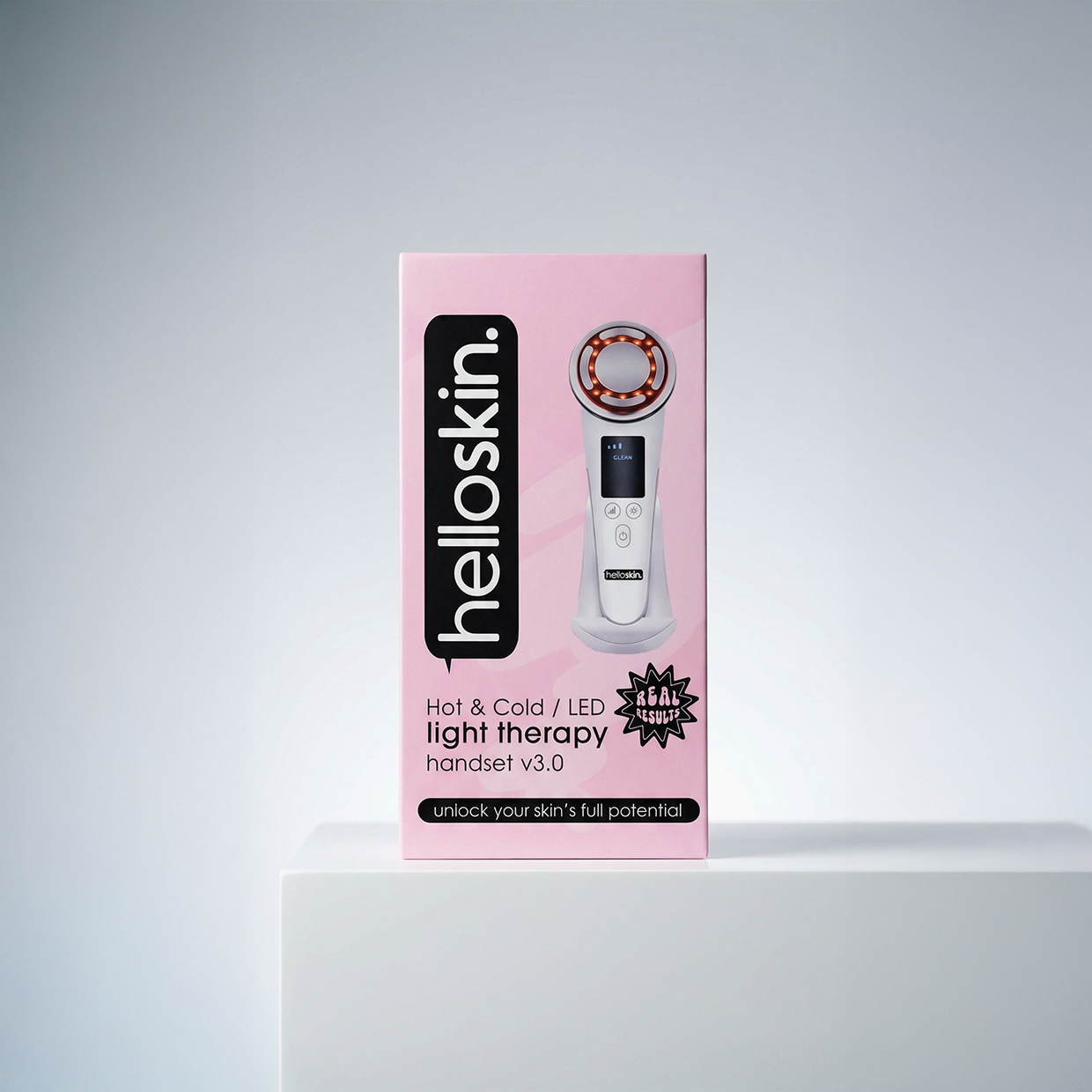
Science-Backed Skincare
The brand should feel premium and informed first, then expressive in carefully chosen moments. Neutral structure does most of the work. Purple and pink appear as directional accents, not as the whole interface.
The best Helloskin sections pair dense educational copy with soft ingredient-led colour transitions and strong text contrast.
Typography should feel recognisably Helloskin even before colour is added.
Overusing the display face, high-saturation gradients everywhere, or deep UI chrome that makes the page feel like an app.
This page is for internal review only, so clarity and faithful token mapping matter more than conversion patterns.
Your cart is currently empty.
Not sure where to start?
Try these collections: